Christmas Cards For Simpsons Special Care Babies

It’s nearly that time again, Covid may have dominated 2020 and even if we cannot be with loved ones in person during the festive season, we can still show we care with a Christmas card.
I was asked to design Christmas cards on behalf of Simpsons Special Care Babies and in spite of it being high summer with the sun blazing away, I said yes. Besides helping a charity which certainly needs as much help as possible in the current crisis I thought perhaps drawing some wintry scenes may cool me down in the 38 degree heat wave.
So I got to work. I would like to share some of my creative journey with you.
The brief was to design Christmas cards with the theme of giving in mind whilst using the logo colours purple and red to render the illustration. As with most of my illustration especially in my children’s book work, I do love to add a level of humour also, even if it’s just the character design itself.


I do a lot of research for character design in my spare time. I tend to use animal encyclopaedias, Google images and my favourite youtube animal vids! I find that watching funny videos provides a greater level of character which I try to emulate in my character design.
There was one design that I put some personal narrative into, and that was the Christmas Carolling one. Every Christmas eve when we were kids, we had to go around the village to friends with our music sheets. At the time especially as I got older, I do remember trying to hide behind hedges out of sheer embarrassment but out flashing fairy lights gave us away. So there we were money bucket (if my sister and her best mate didn’t run off with it), tacky fairy lights and my dad’s ancient dusty fiddle singing Good King Wenceslas and all them old chestnuts, we even got paid to not sing at someone’s house one year (they said they just got the baby to sleep but I don’t know about that).
So inspired by this I did a pencil rough; initially it was landscape but I thought portrait utilising the front door frame would work better. I wanted to incorporate Edinburgh scene in also, so I found on google images a nice image overlooking Princes Street Gardens and The Mound.
After the rough pencil stage, I render the components with block shapes. This gives a better feeling for the composition before adding texture.

I make my own textures and apply them where necessary, sometimes I have to swap and change until I find a better fit. I love using watery acrylic washes for sky textures; I really feel that this helps to set the mood of a scene.
I tend to draw the characters simultaneous with the background but in a separate document, same process; pencil, block shapes, texture, line.

I use different brushes on my graphics tablet to finish them. On placing the characters in situ I have to make sure that they are sympathetic to the background so I will spend some time adding filters to the characters to incorporate them into the scene.
Once I’m happy with the shapes and textures I like to spend a considerable amount of time drawing in line detail. I use different brushes to create soft, hard, broken or a smooth finish.
On this particular image I really wanted to convey the juxtaposition of inside/outside. I think the cosy warmth of a place is always felt better when you have the contrasting coldness outside making itself present in some way, either through a door or a window. So I added some filters to the illustration to make the light and shadow.

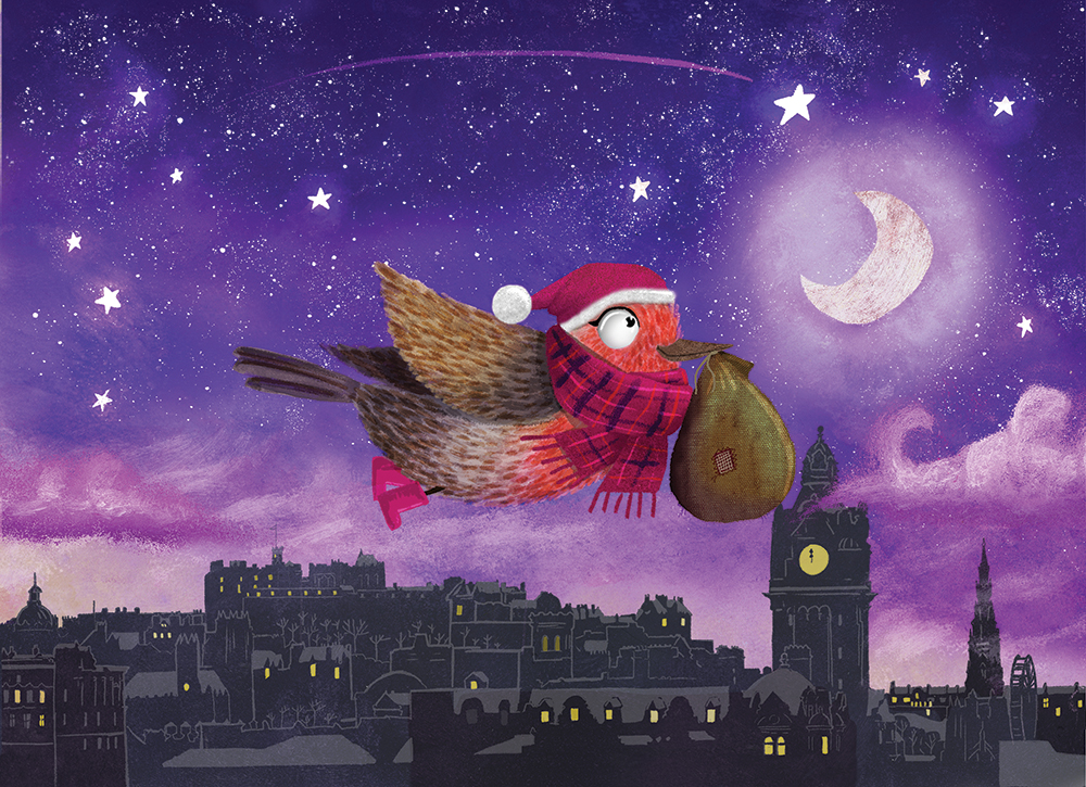
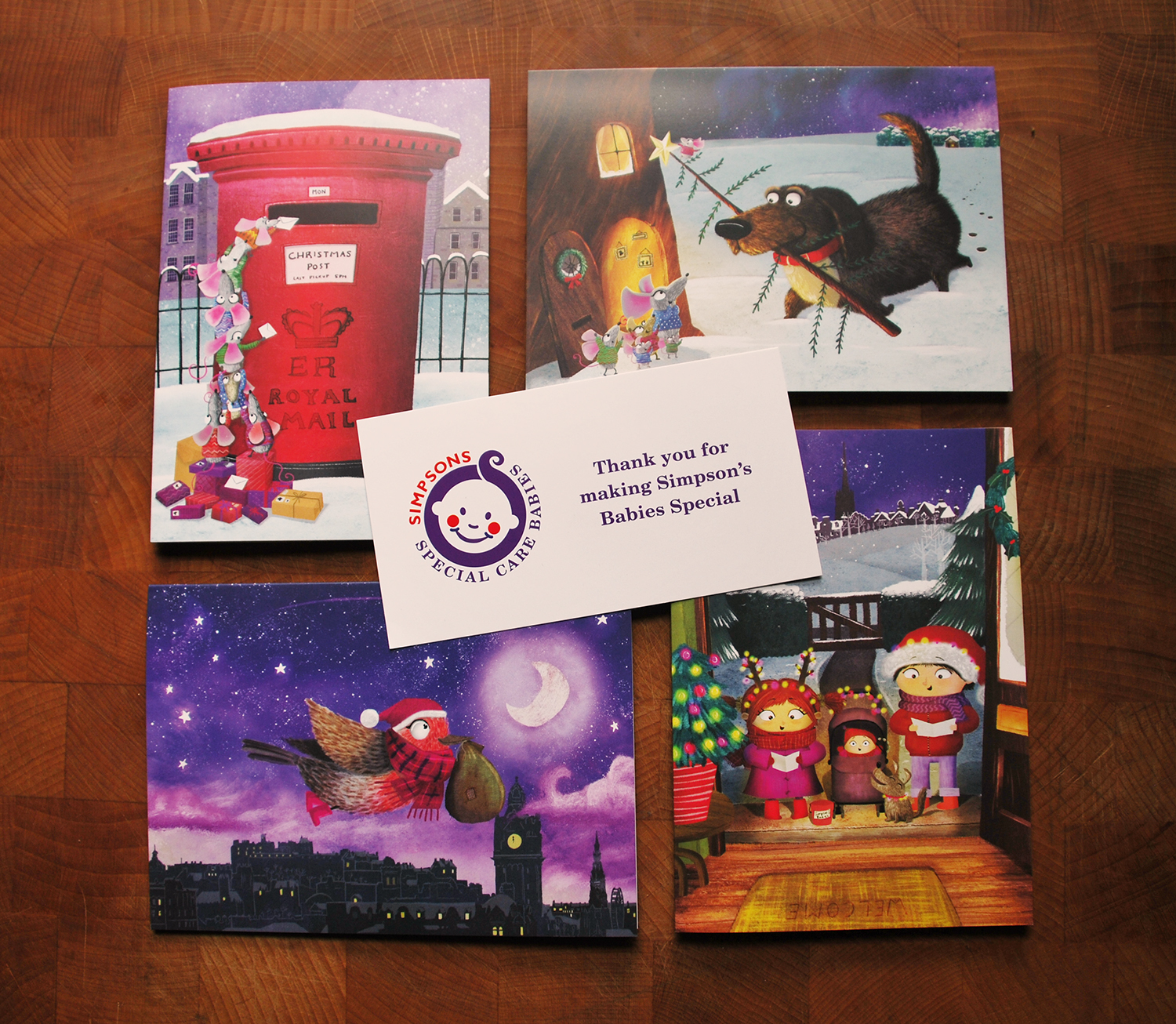
This is just one of the illustrations I made. The other designs are shown below.


You can purchase your Christmas cards by visiting the sscb.org -> 2020 Charity Christmas Cards.
